Progress Indicator

Progress Indicator
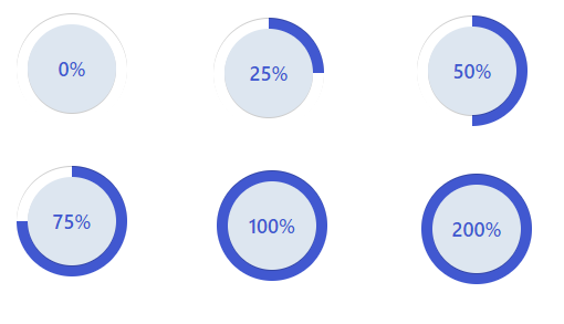
A control to visualize percentage values stored in a text field (1–100%) as a progress bar. The control automatically adjusts bar length and color based on the value, and displays the percentage inside the bar.
Features:
Works with Single Line of Text fields containing values between 1–100%.
Displays a progress bar with centered percentage text.
Color changes dynamically:
< 30% → 🔴 Red
30–50% → 🟠 Orange
51–99% → 🔵 Blue
100% → 🟢 Green
Smooth animation and responsive design.
Simple, no external dependencies.
Author: Haseeb Ahmad
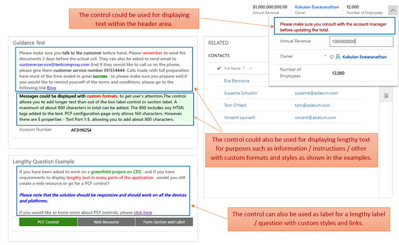
Simple Text Control
A control to display text with custom style using HTML tags or CSS styles on a Unified Interface ...

React Shaking Text Virtual Component
A control to draw attention to the text or create a sense of urgency, importance, or excitement.